Setting an Elite standard
Kenmore
Kenmore partnered with Sundberg-Ferar in the development of their next-generation small appliance visual brand language (VBL). Kenmore was ready to hit the reset button and explore a complete line change. They leveraged SF’s research and industrial design teams to explore new aesthetic directions for Kenmore and design multiple product families. SF then applied its proprietary MAPSS research technique, (Measuring Adoption Propensity for Styling Selection), to help Kenmore select a direction that not only satisfied mass market desirability, but would also lead amongst early adopters and styling influencers.
The team refined the VBL to complement Kenmore’s manufacturing capabilities and deliver a sophisticated tapered body theme with angled chrome accents, elevating the premium appearance of the Elite line.

Market
Consumer Products

After initial design exploration work, Kenmore and Sundberg-Ferar chose three design themes to take into a research phase. These design themes were compared against the two premium market leaders in a brandless design study.
The design theme that wins the largest mass market appeal is not always the best choice if it’s revealed that it’s not as desirable amongst style leaders and early adopters. Uncovering this insight is the purpose of our MAPSS technique. One design theme in our research for Kenmore, coined “architectural elegance”, not only won amongst the mass majority and amongst styling trend leaders, it also beat out all of the competition. Research results sometimes leave room for internal debate, but in this case, the winning VBL was clear.
Sears: Kenmore™ and Kenmore Elite™ Visual Brand Language
When relaunching a visual brand language it’s important to be ahead of the adoption curve and win with trend setters and early adopters, even if it’s polarizing to many at launch. If you have a product that wins with both segments, you know you have something special on your hands.

Human Impact
Small appliances occupy a space in the kitchen that serve a purpose, but also make a visual statement as part of the homeowner’s personal aesthetic. This line for Kenmore has a unique form language that breaks away from the normal cubism of appliances, to uplift and bring elegance to the countertop by tapering the forms, even with traditionally square items like toasters and ovens.
Business Impact
The team designed four appliances within this project to launch the new VBL, but also developed a robust styling guide depicting clear product details for every physical element of the Kenmore product line, yet left room for interpretation as future design, engineering and manufacturing teams translate the theme across the remaining thirteen appliances in the lineup.

Other Consumer Products Projects

StoryPoint : Senior Living Research
Diving deep into the wants & needs of retirement-age users as they evaluate living in a Senior CommunityStoryPoint Senior LivingWith the size of the U.S. senior population expanding, and competitive pressures increasing, StoryPoint, one of the top 25 largest...

Michigan Virtual: What Can We Learn From Emergency Remote Learning?
A design-focused look at the experiences of educators, students, & parents during emergency remote learningMichigan VirtualBetween March and June 2020, statewide school closures due to the COVID-19 pandemic caused major disruptions in both learning and daily life...
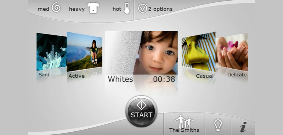
Electrolux: The Marriage of Physical and Digital Branding
The Marriage of Physical and Digital BrandingElectroluxElectrolux collaborated with Sundberg-Ferar to explore the transition of their brand into the digital space of the embedded control screens on their products. This represented an opportunity for the company to...