
Try to remember the last time you used a product or app that was so frustrating you swore out loud or in your head. For me it was in my car as I was about to leave for a weekend trip to visit friends in Milwaukee. The kids were in their car seats and my wife and I were getting in the car after putting the bags in the trunk. I launched google maps and entered in the destination as I got in the car. It popped up, saying 5hr 30 min drive. I started my car and plugged my phone into my USB cable. Android Auto launched as I started pulling out of the driveway, but nothing happened. Where was my navigation? Why wasn’t it giving me the directions that were on my phone and displaying it on my car’s screen? I had to stop driving, press the search button on the screen in my car and type it in all over again.
If I was still driving, the keyboard would be locked out and I’d have to use the voice commands. We all know that’s not really an option because the assistants are half useless. How’s that for convenience?
Question: What’s the point of the Android Auto interface that is powered by your phone if it can’t even give you a seamless transition on Google Maps – arguably the most used feature and one of the main reasons it even exists? It may seem like I’m overreacting, but my “smart” phone and car promise an easier and better driving experience. I didn’t experience that. It actually added more steps to my drive. It failed at its main purpose, its core functionality. It was frustrating to use.
Products with usability problems are fairly common. Take Google Glass for example, I can think of many tasks in my life that it could make easier, like trying new recipes in the kitchen or it can walk me through removing 20 parts off of my car to replace a tiny sensor. The problem with it is social norms. It made people look strange and it made the people around them uncomfortable. People were so uncomfortable that businesses and public places were putting up signs banning it. Take a look at this guy who doesn’t want to walk around making that face.

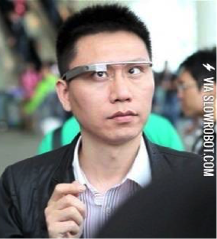
Society’s response to Google Glass shows how important it is to understand everyone’s emotions including the user’s.
The brand new $6700 i9 Macbook Pro is getting a lot of criticism for how hot it gets and that the performance needs to be throttled to cool it down. That experience doesn’t match the expectations set for the most powerful laptop on the market and the price tag that goes with it. It is communicating to the user “don’t make me work hard”. It sounds like they didn’t design it properly. How a product reacts to interaction is just as important as how it’s used.
The keyboards on the 2016-17 Macbook Pros don’t move much and don’t feel good when typing. People don’t like using them. Now, add the possibility that a single crumb can get under a key and render it useless. That’s not very useful.
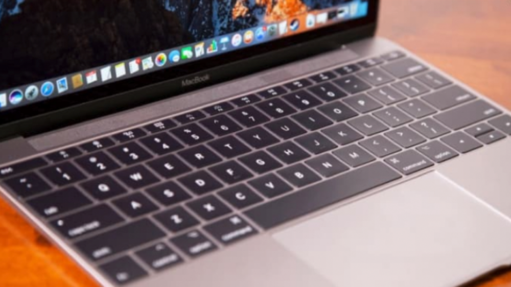
The keyboard is one of the primary interfaces on that product and if people don’t like using it, it’s a failure. The lack of tactile feedback of the keys and the pursuit of “How thin can we make it” contributed to this failure. Why does this happen?
There is one very important thing we need to talk about before digging into making usable products. You need to ask the right questions. What is the purpose of your product? What is the primary function of it? What problem is it solving? In a simple statement, what does it promise the user? What expectations do they have for the product? These need to be answered before you worry about designing and testing a product. It will be your guiding light, it brings focus and it prevents feature creep that can kill a good product.
Having said that, why am I writing this article about usability? I want you to make products or services that aren’t failures and so does everyone else. You might be thinking, “Great, thanks for the tip, that’s really enlightening”. Ok, just hear me out. This isn’t one of those condescending, esoteric, designer-y articles that talk down to you about how you aren’t good at your job, that you suck at developing products and that’s why you should hire me. I’m going to tell you about my experiences as an Industrial Designer and as a consumer. Hopefully they will inform you and inspire you to design great products and if necessary, be disagree-able, fight the man, and get your new baby in front of some people and test it.
This is the most important point in developing usable products. Test it, test it, test it. Keep it under wraps if you have to. At a previous job I didn’t have a research budget for new products. I would test the products on our customer service team, people I knew, and/or friends of friends. You’d be surprised how wide your network is. Ask around for people who use certain products or engage in certain activities. You’ll be surprised how many people will agree to it even without compensation. Just be respectful of their time and try to accommodate them and their schedules. After a about a year of doing user research, my project teams and the executives came to expect to hear about what our users thought and how we were designing to meet those needs.
Obviously you won’t get any quantitative data (large sample size) this way, but you’ll get quality feedback that you can design around (qualitative data). You’ll be amazed at what you can learn from others and how it challenges your assumptions. One of the traps to avoid here is that you do not want to take their word as gospel. Their ideas are not always good ideas and sometimes they will be so used to interacting with something, they might not think there is a better way. Watch them use it, listen to their pain points, what they liked, and try to improve their experience.
In team meetings and project gate meetings I would talk about my design decisions and I backed them up with user feedback. One great thing about this is that it helps to eliminate opinions. If you have tested interactions from the users, you know their preferences and you understand how they use it, it will be hard to argue against that.
If you work with a boss, co-worker or executive that over-rides some of your decisions, user testing can help prevent that. It can be frustrating, and you may feel defeated by it but don’t let up. Raise your fists high and keep up the good fight. Eventually others will see value in what you are doing and as your track record of successful product launches gets longer, you will be trusted more, you’ll have more freedom with your process, and it will become harder for that person to veto your designs. If they still do, it just means they’re an egomaniac.
Here is another important point I want you to take from this article. Nothing bad comes from user testing. I’m going to repeat it. Nothing bad comes from user testing. It may seem like it sometimes if no one likes the design, but it will guide you to make a great product. If it can be improved, then fix it. If something is going to fail, it’s better off failing during user testing than after all the tooling has been kicked off and product has shipped. Pretend you’re using your money to pay for the cost of developing and launching the new product (on average it is around $15 million).
Remember Product Development is supposed to be an iterative process. Insights can be gained each time a prototype is put in front of a user. Repeat as necessary until you are confident that what you’ve designed will make the world a better place, even if it is just a tiny bit.
I think about 2 min of user testing would have revealed the flaw in this product.
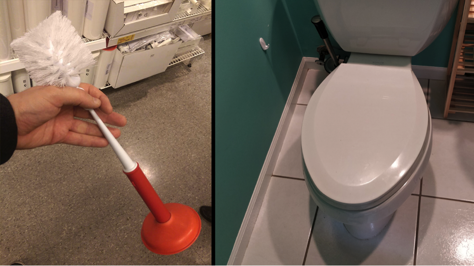
Where do you hold this thing? What good is combining objects for convenience or space savings if you don’t want to touch it?
Here is another one that is unbelievable. It’s a failure of the physical design, branding, and graphic design. The lesson here is that you need to be aware of how your product looks compared to other objects that someone might own or objects that you make!
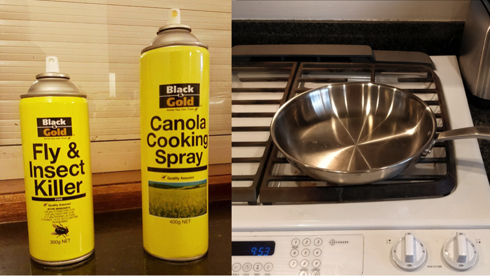
The Visual Brand Language here is not applied correctly. It does not mean everything looks identical. Insect killer should never look identical to cooking spray. You would never want to use the wrong one.
I also want you to think about the product’s life and how it looks as it gets used. The phrase “too cool to do drugs” sounds like a good idea to put on a pencil but presenting a phrase in the wrong direction can say the opposite of what you intended.
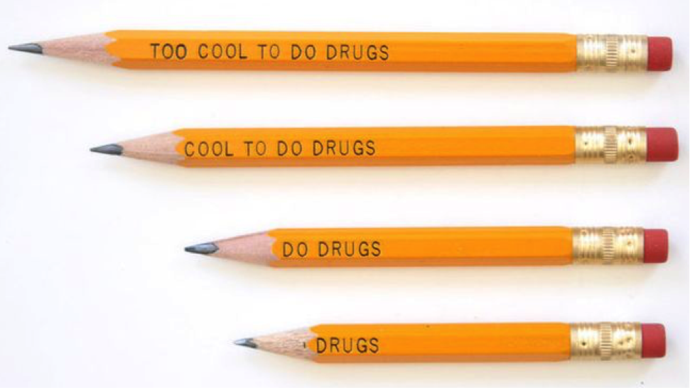
The majority of the time this pencil is being used it has the wrong message. About a minute of sharpening different lengths would have made this obvious. Two lessons here: 1 – actually use your product or simulate its life as a consumable. 2 – Don’t rush a project.
Ok, so what are some techniques you can use to make your product useful?
One piece of the puzzle is to design your product to look the way it functions. If someone understands how it works just by looking at it, you’re half way there. Take for example this safety device I designed called a Blind Flange Lockout.
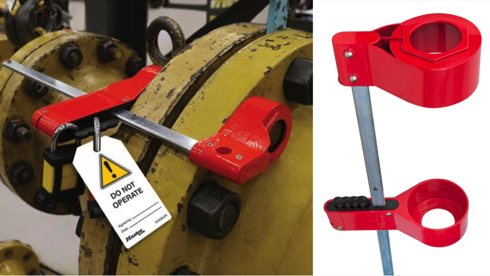
It prevents a blind, which is a metal plate used to block the flow of a liquid or gas through a pipe, from being removed unintentionally or accidentally. This way repairs or maintenance can be completed safely. Imagine that it’s your job to weld this pipe that transports an explosive gas. You’re going to want to know that it is turned off and cannot be turned back on until you are done.
In this case the hex shape on both ends of the red cups hint to the user where it’s supposed to go and what it’s supposed to cover. It needs to cover the nuts and bolts on the pipe flange to prevent them from being removed. It would still function the same without them, but that intentional addition makes it more intuitive.
Another approach to take is finding something users are familiar with and incorporating it into your new product. The Blind Flange Lockout needed to adjust to different thicknesses of pipe flanges and lock in place. An adjacent product that does this is an Irwin Quick Grip clamp. It’s my favorite clamp to use because it’s so quick and easy. My project team and I felt that the quick sliding and locking of its two elements were a perfect fit for what we needed. Combine this slide/lock mechanism with the hex shape on the cups and it is pretty straightforward in how it’s used. We gave it to users and they understood it, liked using it, and trusted that it would keep them safe.
Now let’s address some of those important questions you should answer when designing a new product. What is its purpose? Who is it for? Why do people use them? What do they need to do? What do they promise to the user/owner? What is the ideal experience? I’m going to answer using padlocks as an example.
Padlocks are used to keep people out, to prevent them from taking or using specific objects. People use them because they care about what is behind the lock or they are trying to keep dangerous things from the people they love. Locks allow access to the right people and prevent everyone else from getting through. They promise to the owner that their belongings are safe or that dangerous items won’t be removed. Padlocks promise peace of mind. Owners have to trust their security products. We wouldn’t have arrived at this level of understanding about the padlock and its owner without asking the right questions.Typically, you won’t be able to answer all of them without doing research. This information is high level and will give you direction. It will not tell you the details of interaction, like if a lock should have a key or combination, where to place the interface, or how it should be used. Those details depend on context, the environment, where it lives, who is using it, what their needs are, etc.
Padlocks are also a great example of how a basic, utilitarian product is directly tied into the emotions of the owner, and what makes a padlock useful. Asking the right questions will help you to empathize and transition into the mindset of your users. You will begin to care about what they care about.
For example, how does someone trust a security product like a padlock? Consistent interactions, durable, long lasting materials, and strength. It has to work every time. What is the ideal experience for an owner/authorized user? No interaction with the padlock. This product really isn’t for them. Its main purpose is to keep other people out. Therefore, two user experiences need to be designed. One that is minimal and quick for the owner and the other that is difficult, frustrating, and time consuming for everyone else.
A padlock fits this model well. Take a key, flip the bottom of the lock up, insert it into the lock, rotate it about 90 degrees -click! – the shackle pops open, unloop the shackle and you are done. It’s a simple and quick interaction,but to break into it, specialty tools, time, and skills are needed. Is it worth all that if you don’t even know what’s in there? Criminals usually move on to something quicker and easier.
Can the experience be even better? Yes. Remember, the ideal experience with a padlock for the owner is no interaction or as close as possible to that.
An existing example of this is leveraging the low power draw of Bluetooth 4.0 and the ubiquitousness of smartphones to create an opportunity for a new kind of padlock.
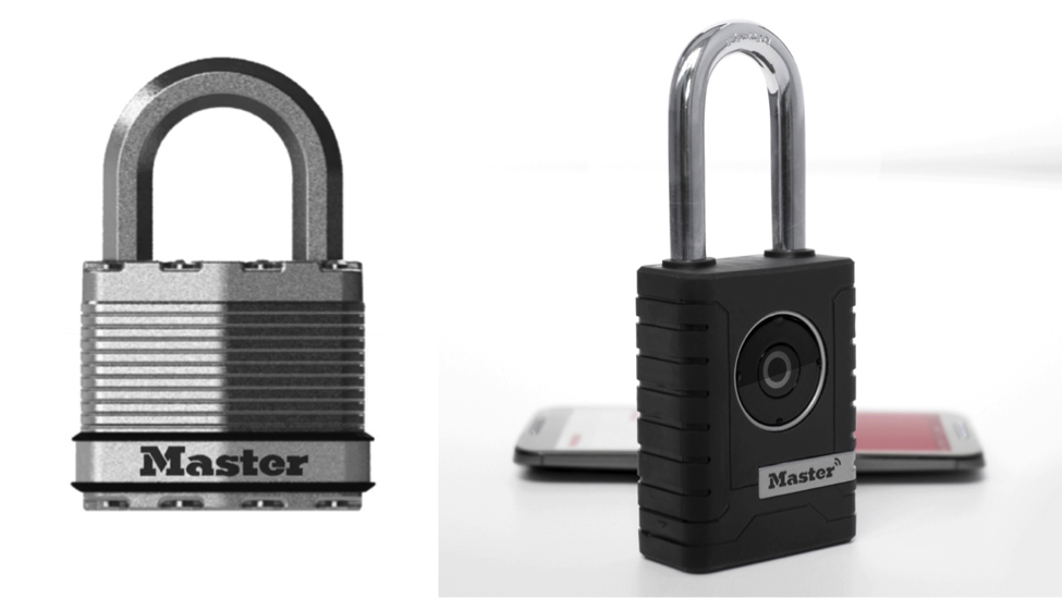
No key, no code, nothing to remember, just the press a button to unlock, and unloop the shackle. It’s quicker and easier than a key or combination.
Emotions drive a large part of our decision-making process. What I want to get across with this smart lock example is, find out how your product and the features it offers affect the user’s emotions.
Let’s talk about sharing access to a lock. Sounds simple enough, right? But, it’s not. People worry, they have anxiety, and they may not be willing to share a key or combination to the things they care about. All of their control is lost. A combination can be shared and keys can be copied. There are some things that can be done to alleviate these emotions if a phone is the new “key”. Let’s talk about trust and how that changes depending on the person you know. There is a hierarchy in a person’s social structure and they trust some people more than others. There should be different levels of access that correspond to how much you trust someone. I’ll list an example of some people from most trustworthy to least:
Spouse – Full access and settings control
Best friend – Full access
Neighbor – Daytime access
Friend you don’t really trust but could help you in a pinch – Short term or limited access (a few hours)
A hired hand – Short term or limited access (a few hours)
Extended family member – Never
Your order of trust worthiness might be similar or the exact opposite. The important thing is that they have the right amount of access. An app and smart lock can offer this kind of customization. Since the interaction with the smart padlock is at a minimum, the app has to pull all the weight.
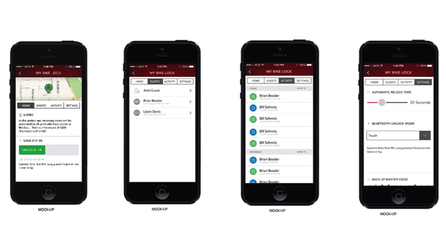
The app for this Bluetooth padlock allows you to select the specific lock, the person you want to share access with, and the type of access you want them to have. Then press send to share access with someone you know. Giving back the control of shared access to the owner reduces stress, anxiety, and improves their life.
Finally, what is something that is often overlooked when talking about usability? It’s aesthetics. Now you might be thinking, “Oh, here we go, of course an Industrial Designer is going to make aesthetics an important part of usability” but just tell your brain to quiet down for a second; I’ve got some facts and research by scientists to back this up.
The name for this is The Aesthetic-Usability Effect. This affects the mental state of the user, not the actual physical interaction with the product. Attractive products will put users in a better state of mind, which means they are more patient, open minded, flexible, and will let minor things slide. They will perceive the product as easier to use and are more likely to speak positively about it. If a product looks cheap or poorly put together it has the opposite effect. It will be perceived as poorly designed and not as easy to use. Now let’s get down to brass tax.
The first documented study was conducted in 1995 by two scientists, Masaaki Durosu and Kaori Kashimura from the Hitachi Design Center in Japan. They were testing how aesthetics affect the perception of usability. They tested 26 different aesthetic variation of ATM interfaces that all functioned identically. 252 participants were asked to evaluate the interfaces on how easy they looked to use and how beautiful or attractive they were. They found that the more attractive interfaces were perceived to work better. Here were their findings: “These results show that the apparent usability is less correlated with the inherent usability compared to the apparent beauty which showed the correlation coefficient of 0.589. This suggests that the user may be strongly affected by the aesthetic aspect of the interface even when they try to evaluate the interface in its functional aspects and it is suggested that the interface designers should strive not only to improve the inherent usability but also brush up the apparent usability or the aesthetic aspect of the interface.”
If you would like to dig further into how and why aesthetics affect usability read a book by cognitive scientist Donald A. Norman called Emotional Design: Why We Love or Hate Everyday Things.
Another test with smartphones was also done with 60 participants in 2010 by Andreas Sonderegger and Juergen Sauer.Teens were asked to evaluate the usability of a phone based on completing specific tasks. 2 phones were used with identical functionality, one that was visually appealing and the other that was not. You guessed it, the attractive and nicer looking phone was perceived to be easier to use and they thought it was faster.
This is part of human nature, we also do this when we interact with each other. Alan Feingold from Yale conducted a study about this in 1992 called “Good-Looking People Are Not What We Think”. We tend to like attractive people more, we’re more likely to give them the benefit of the doubt, trust them more, and think they are happier just based on their appearance.
So the next time someone tells you that it doesn’t matter how a product or app looks, you can say, No! It does matter. It’s was proven 23 years ago!
Thank you for taking the time out of your busy day to read this article. I hope you got a few nuggets that you can use in the future to create a great product or convince someone to join you on your quest to create useful things that people actually want to use. Remember, define the purpose of your products, understand your users, the people around them, their emotions, how they use their products, improve their experience, make it appealing and test, test, test.
References
Feingold, Alan. “Good-Looking People Are Not What We Think.” Psychological Bulletin, vol. 111, no. 2, 1992, pp. 304–341. American Psychology Association, www.gwern.net/docs/iq/1992-feingold.pdf.
Hein, Buster. “Apple Finally Acknowledges Its New MacBook Keyboards Suck.” Cult of Mac, 22 June 2018, 3:14pm, www.cultofmac.com/557431/apple-finally-acknowledges-its-new-macbook-keyboards/.
Kurosu, Masaaki, and Kaori Kashimura. “Apparent Usability vs. Inherent Usability: Experimental Analysis on the Determinants of the Apparent Usability.” ACM Press, CHI ’95 Mosaic of Creativity, 1995, p. 292.
Sonderegger, Andreas, and Juergen Sauer. “The Influence of Design Aesthetics in Usability Testing: Effects on User Performance and Perceived Usability.” Applied Ergonomics, vol. 41, no. 3, 1 May 2010, pp. 403–410. Google Scholar, scholar.google.com/citations?view_op=view_citation&hl=en&user=4DQsjnwAAAAJ&citation_for_view=4DQsjnwAAAAJ:u5HHmVD_uO8C.